overview
opportunity
project type
mobile design
duration
4 weeks
my role
ui/ux design
user research
prototyping
software
after effects
illustrator
figma
solution
A more accurate soundtrack to your life: find music that aligns exactly with what you're feeling.
Core flow
01 Discover & Browse With Ease
A Netflix-style swipe and clean homepage for accessibility; the most crucial information at the top: your recent "mood mix", favorites, trending, etc.
02 My Moods
Dive into a new music session with songs tailored to your current mood. Recent "moods" are personalized tracks generated by Pandora to fit the exact emotions you've been experiencing.
03 Find Your Current Emotion
Organize your thoughts and let Pandora know exactly how you're feeling. Choose a series of images that best aligns with your mood, and Pandora will do all the rest.
04 Songs Picked Just For You
Dive into songs generated to fit your exact mood. The color background is animated to match the rhythm of the music, helping users visualize and feel the music. Scroll to learn more about the artist, save songs to customizable playlists, or find similar tunes.
research
On the hunt for good music . . . and lost.
A common theme among Pandora users: difficulty finding music that suits the exact mood for daily activities. Song generation did not align with emotional accuracy.
The Pandora app is primarily used to discover new music with curated radio stations. The user flow includes three main tasks that are quite problematic and limits user autonomy.
Hover below for more insights.
1
Search for songs, artists, or genres.
2
Create a radio station, add to collection.
3
Edit your personal collection of stations.

Trying to play a specific searched song redirects users to ads or randomized, unrelated songs in a radio station.
Competitive analysis
Is it easier to find music elsewhere?
Other large music platforms used more advanced algorithms to find similar songs based on genre, and the listening experience was more customizable, yet the overall designs were still cluttered and visually overwhelming, with still no way for users to give input for what plays next.
Apple Music
Spotify
Apple Music
Strengths
Easy navigation + viewing of songs
Short button clicking sequence
Create custom playlists
Pain Points
Cluttered discovery features
Suggests music only by artist and genre similarity

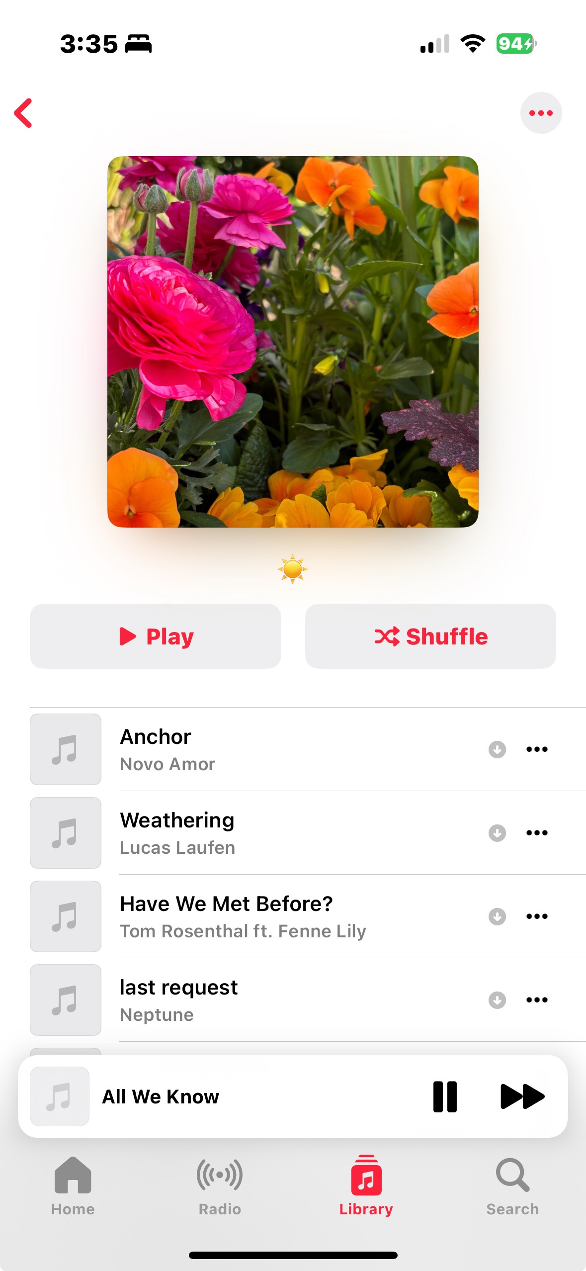
Screenshots from Apple Music
process
Getting organized with key intentions and interactions.
I created a UX Pyramid to set my priorities straight and guide my decisions concerning the user flow of this design.
Customer Benefit
curate music with more emotional accuracy
UX Pillars
personalized, emotion oriented interface
fun and engaging interactions
insight into listening habits and emotional state
Signature Experiences
discovering your exact moods in every musical moment
track music + emotions throughout time
visualizing music with color and shape
design & iteration
Creating a breathable visual language.
My first few wireframes featured minimal layouts with muted and dull color palettes to create a quiet space for the music to itself to shine. As the project evolved, I pivoted to a more vibrant yet softer visual language, using airy glows and gradients to create a more breathable, emotive, and flowing interface that highlighted content.


Initial wireframes
final refinements
UI & Assets
quiz symbol sets
music gradient backgrounds